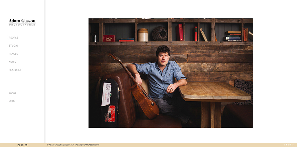
After a long process I’ve finally given my website a major refresh with a new design, new work and a new font. One of the big changes is the inclusion of a studio photography portfolio, something my old site lacked and one of the areas I’ve been working heavily in recently. I’ve also added a portfolio named ‘Places’ which includes commissioned and personal work, shot on location, with a more lifestyle photography feel to them.
As I said it’s taken a while. I really wanted a site that was clean and a gallery that allowed the images to be seen without page furniture distracting the viewer. A fully bespoke website would’ve been ideal but unfortunately my budget wouldn’t stretch that far so, in the end, I’ve settled on a template that has been modified to mimic my original designs. One or two niggles aside I have to say I’m really happy with the final result. I don’t tend to change the site that often (I think the last refresh was five or six years ago) so I’m very happy (relieved) that this design has worked.
Now it’s on to the refresh of my music and wedding portfolio websites!
Recent work by Bristol photographer Adam Gasson.

